Schedule Squid
A class scheduler that doubles as a homework planner.
PDF link for Final Report
Final Report
Problem
College presents a whole new world with so many things to do and people to schedule meetings with. However, it is important for students to balance out their social lives with their school work as well. Schedulers that students use today can get quite cluttered with all the meetings, extra curricular activities and assignments that have to be done. This can be overwhelming to look at and it makes it quite hard for students to prioritize their school work. The Schedule Squid application is a simple online planner for scheduling assignments and classes. Limiting the functionality of the planner to only schedule assignments and classes helps solves the issue of clutter. This will let students easily view when their assignments are due, which will allow for them to better manage their extracurriculars around their school work.
Our users are mainly college students. When using a planner, their tasks involve:
The following diagram shows the tasks involved when inputting an assignment in a planner:

The following diagram shows the tasks involved when inputting a class in a planner:

The following diagram shows the tasks involved when viewing an assignment:

Sure, there are plenty of virtual calendar alternatives - but a lot of them have a ton of interface issues and features that are simply unnecessary for a student, clogging up the whole user experience. A college student’s planner will probably only have reminders of, at most, three different types: classes, assignments, and extracurriculars. Further, a lot of these are repeating events, like classes and certain extracurricular activities. We wanted to design a calendar app that was as convenient, easy to use, and applicable as possible for the demographic with probably the shortest attention span on the planet: college students. Our application aims to be the perfect solution for a student.
Design
As stated in the problem description, we were aiming to make our application as simple and easy to use as possible. Not a ton of extra fluff, as we felt that would clog up the user experience and take away from the goals we were actually trying to solve.
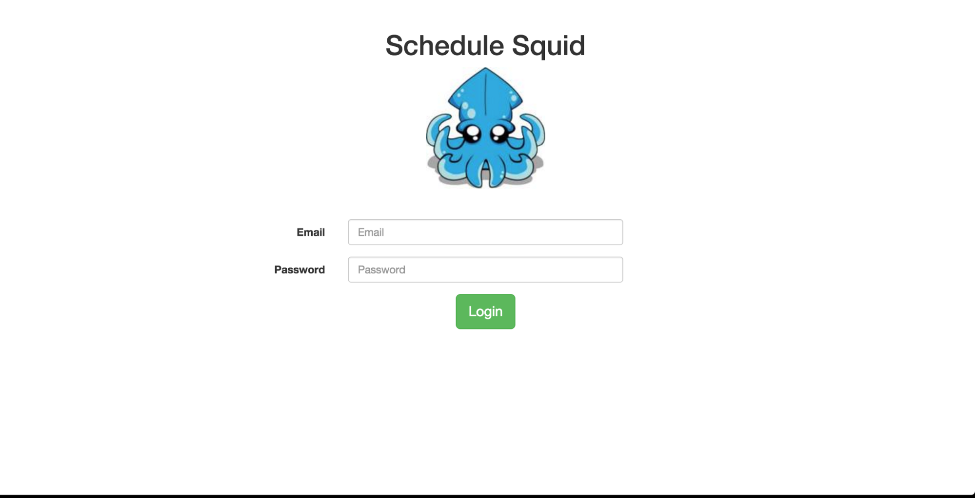
Above is our login page. There is not really a whole lot to be said about it (which is good, as that pushes our agenda of having everything as simple as possible). We have a ton of white space that’s evenly spaced and nice to look at. In addition, we have a great logo that is great for branding purposes - which doesn’t really contribute to the user interface experience a great deal, but having a good logo is truly crucial for a good app in our opinion.
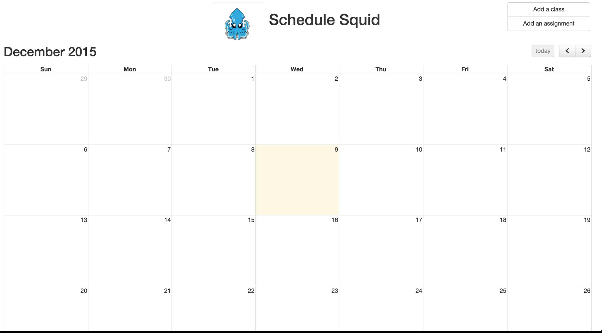
Above is our actual calendar view, which appears immediately after logging in. This was something that went through a few iterations before we settled on it. Originally, our calendar was about half the size and floated to the left, leaving a ton of white space on the right for the “add class/add assignment” widgets. After a ton of user feedback, we learned that people much preferred this larger calendar view, which we came to really like as well. It makes more sense in terms of letting the user know that the calendar itself is the main and only focal point of our app. If we left the calendar much smaller, we might be implying that the calendar was just a part of a larger application. However, moving the calendar (and thus taking away the room for the widgets), meant we had to think of a new way to display how to add elements to the calendar. Generally speaking, the top left is really common place for a user to look when searching for options on how to edit something - so we put our adding buttons up there.
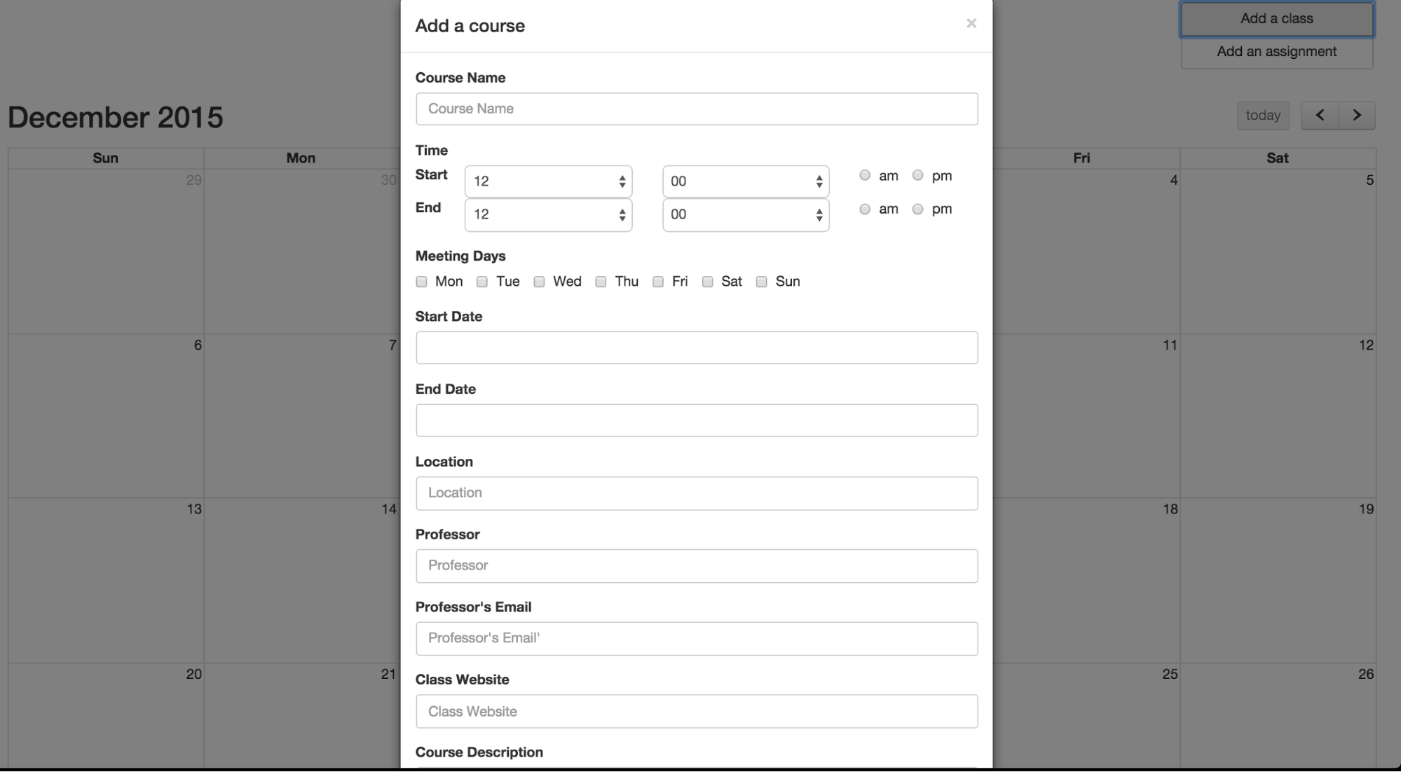
Now that the calendar takes up the entire screen, we opted to have the addition dialogues take up the center of the screen as well, and just have the app’s focal point switch to this dialogue. This was accomplished by putting the calendar in the background while the dialogue is up. To adhere to good design principles, we have an easy exit from this “add course” or “add assignment”, by simply clicking anywhere off the dialogue box. Something our users also really liked was if you close the window before finishing the task of adding something to the calendar, and go to add it again, all the information that you previously filled out will still be there, so you don’t need to re-enter anything you’ve already put in. Another design choice that was made with exclusively students in mind was the concept of repeating events. A user can specify the days of the week that a class occurs (as you are probably not going to have a class that meets one time and one time only). This makes it so there is the least amount of work possible to get what the user needs onto the calendar.
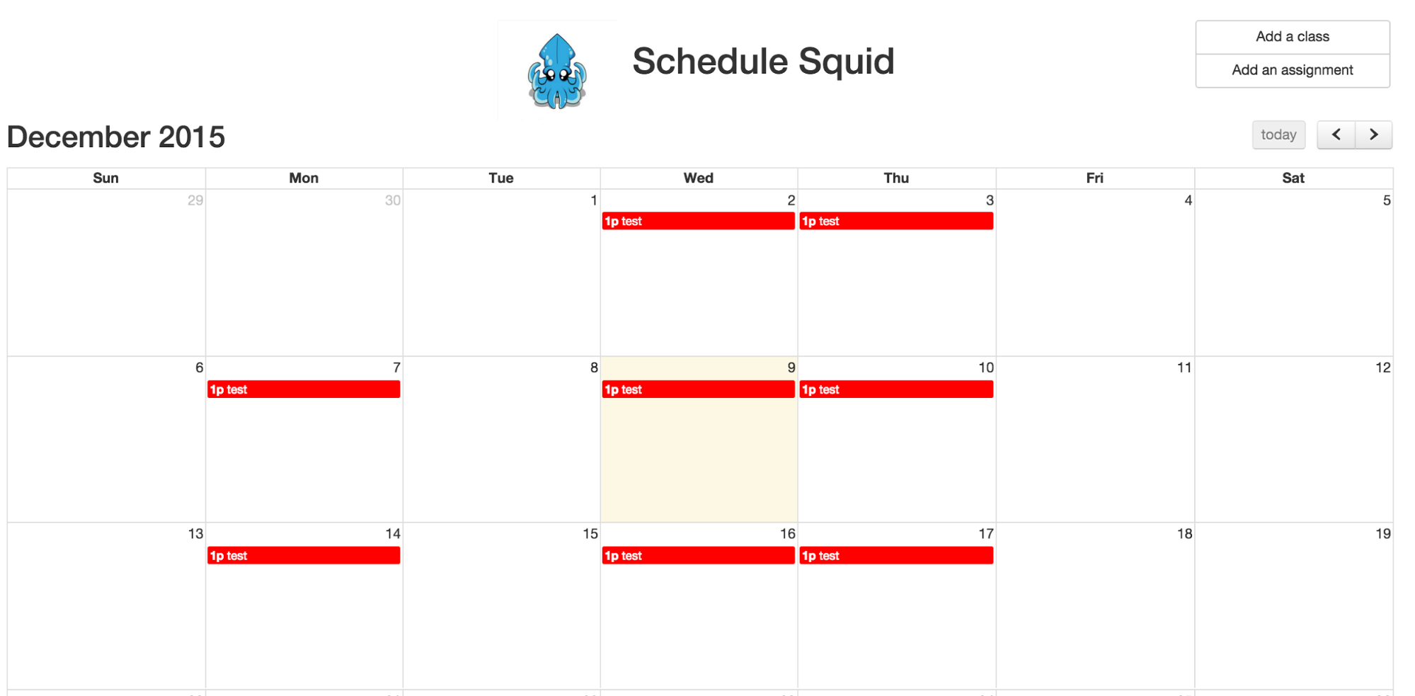
Once something is added to the calendar, it comes up on any day that the user specified. These repeat until the calendar reaches the “end date” that the user entered (for a student, this would probably just be the end of the semester). In addition, the colors we chose are bright and easy to distinguish. We got feedback from users during the final evaluation that they would really love to be able to personalize their calendar by deciding what color a class would show up as. This is something we really wanted to implement but sadly did not have the time to do.
Our whole interface can be described in a few pictures, which was exactly what we were going for. The functionality provided by the design is just simple enough that it’s incredibly easy to figure out how to use, but it also is practical enough that it can contribute a lot to a student’s school life.
Implementation
This application is essentially a front-end web application. All of the data is stored currently on the client-side. Given more time, we would have moved all of these calendar events into a database, so that users could actually have accounts and log in (from any machine) to view their self-made calendars. This choice of sticking to only front end was great for prototyping, but led to the issue that users weren’t able to see their events after logging into a new computer (which is an experience that is crucial to calendar applications in particular). That being said - we’re still very confident that designing this in a web format was the best possible move. Web applications have their own set of external consistencies that are very well known, as most people in the world need to use to the web and webpages in one form or another. We also felt that since it was so easy to access and start using, it made our user testing very pleasant and painless for both us and our users.
In doing this, we used HTML, CSS, and JavaScript. HTML is used to hold all of the pieces of the application, and CSS is used to determine where these things are placed on the page, along with their shapes and sizes. JavaScript is the focal point of writing this application, as it controls the whole flow of data. We utilized a library that automatically sets up a grid-like calendar so we didn’t have to draw one out manually. This was an incredibly helpful design decision for us, as it meant less time reinventing the wheel and more time implementing things that were key to making our application nuanced. Even some suggestions for features that we received during user testing ended up being things that were very easy to implement due to this calendar library.
Evaluation
One of the most common responses we got during our user testing was the desire to modify the color of the classes and assignments on the calendar. Users wanted to be able to select a color for each class and assignment to allow them to more easily distinguish between them at a glance. We didn’t have the time to address this during our revisions between tests, but we could very easily add a color selection to the course/assignment creation. In retrospect, we felt this was something we should have included immediately. Planners are fairly personal to their users, and it makes sense that they would want the freedom to customize them to better suit their needs.
The other biggest issue our users found was that some information about a course that they would have liked to omit (name of the professor, course details, etc.) was required for creating a course/assignment. In later iterations we removed these requirements, though we could have improved even more by labeling the information that was required as such. This would prevent users from encountering errors related to missing information, and make it easier for them to correct in the event that they get an error anyway.
Overall we felt our design was successful in solving the problem we set out to solve, though we could have made it more customizable to users.
Reflection
As stated above, we felt that our process was most successful in developing the functionality needed for our project but not the customizability that was so important to our users. If we had to start again, we would have liked to spend more time with users earlier in the design process. In particular, we felt that interviews with users, perhaps in combination is with very simple paper prototypes or wireframes, would be the best way of determining what aspects of the application were most important to users. Spending this time earlier in the design process would allow us to build an application more in line with user’s wants and expectations.
We also felt that spending some time observing users use other planners, both digital and paper, might help to direct future design decisions. In particular, this would help to narrow down what information users most frequently record. This would guide decisions about what information be made a requirement, and differences between users would give us better insight into possible customization options users would like.
In terms of testing our designs for functionality, we felt we did a good job this time around. Obviously more iterations and more testers would be an improvement, but for the most part we felt that our usability tests were a strong part of our project.