Schedule Squid
A class scheduler that doubles as a homework planner.
Design Sketches
Interaction Scenarios & Storyboards
Problem Scenario 1 - Jack
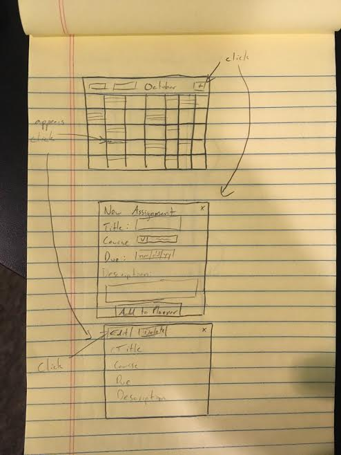
Jack is sitting in class when his professor announces a new assignment. Jack opens a new tab in his browser and navigates to his online planner. After logging in (his browser autofills his credentials to save time) Jack sees a calendar of the month of October, 2015. Scattered throughout the calendar are various assignments Jack has entered for his classes, appearing in the box corresponding to their due date. Jack clicks the plus sign near the top of the screen, because he needs to add something new. A dialog pops up, prompting Jack to enter information including the assignment’s title, due date, course, and description. When he’s finished, Jack clicks “add to planner” to save his new assignment to the planner. Later in the day Jack receives a notification from his professor that the due date for the assignment has changed. Jack returns to his online planner, and clicks on the assignment in the day that it appears (October 28, 2015). The assignment pops out to an expanded view, showing Jack the details he entered earlier, along with options to edit and delete the assignment. Jack chooses edit, then modifies the due to date to reflect the professors notification. When he’s done, he clicks “save changes” to save the update he made to the assignment.

Problem Scenario 2 - Jill
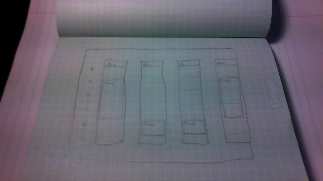
Jill wakes up Monday morning and wants to look at her class schedule for the week before heading out. She opens her browser and clicks her bookmark for her online planner. After logging in, Jill sees her assignments for the month of October, 2015 appear on a calendar. From a dropdown at the top of the page, Jill unchecks “Assignments” and checks “Courses” to change what she sees displayed on her calendar. Because her schedule is the same every week, Jill also uses a dropdown menu to change the calendar view from “month” to “week”, so she just sees the current week with all her courses displayed in columns corresponding to the days of the week. Later in the semester one of Jill’s courses is relocated due to construction. Jill returns to the previously described view of her courses in her planner following the same steps. She clicks on the class that’s been moved to get a pop out with an expanded view of the class, showing information such as the course description, time, location, professor, and title. She selects “edit” near the top of the pop out, and then changes the location to the new one. When she’s done, she clicks “save changes” to save the update she made to the course.

Problem Scenario 3 - Sean
Sean is in the library on a Saturday morning and wants to get started on his homework before his meeting in two hours. He doesn’t remember which assignment he has due first, so he decides to check his homework planner. He opens up the browser and the login page for his planner immediately shows up because he had set this page as his home page so that he can easily access it. He types in his login credentials. He is then brought to a screen that shows the entire month of October 2015 populated with assignments he has due. He sees that his first assignment due is on Tuesday, October 27 for his Advanced Writing course. He knows because he sees that the date is filled in with a blue block titled “Adv Writing”. It is blue because he had set that class color to be blue. He clicks on the block to see what the assignment is. A small pop up window expands from that date to show Sean his assignment details. He sees that this assignment is titled “Co-op Essay.” In the “Due” section, he sees the date “Tues, Oct 27 @ 2:30pm. This is the time his Advanced Writing class starts so he knows he has to turn his paper in before class. In the “Details” section, he sees that his paper needs to be 5 pages long. He also sees a link. He clicks on the link and it opens up a new browser tab that brings him to the rubric for the essay. Sean now has all the information he needs to start his assignment.

Design Options

This is the most standard design for a calendar application. This view shows the week overview.

This is a non standard design. It uses a radial design for showing time. Days go around the circle. Time moves outward.

This view only shows the days that have actual events on them. This is a concise view of the week but doesn't provide the full context of events.
The best design for the main view is probably the first design. Sticking to a traditional calendar design will help users quickly learn how to use the app.
Overall Design
